Giới thiệu
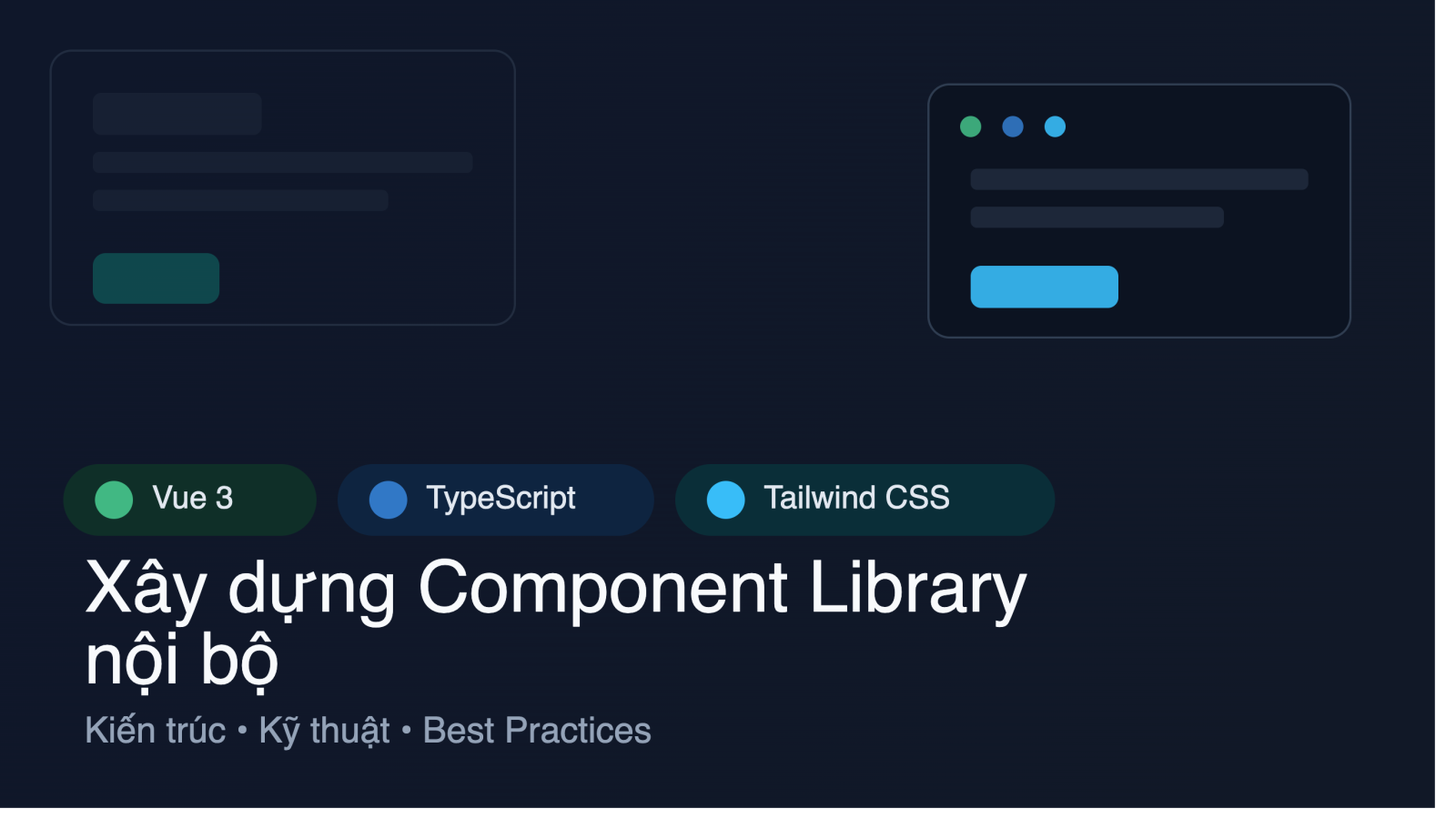
Trong môi trường phát triển front-end hiện đại, việc tái sử dụng các thành phần UI một cách nhất quán và có thể bảo trì lâu dài là yếu tố quyết định tới tốc độ giao hàng và chất lượng sản phẩm. Component library nội bộ giúp các team giảm thiểu việc viết lại mã, đồng thời duy trì một hệ thống thiết kế (design system) thống nhất. Bài viết này sẽ hướng dẫn chi tiết cách xây dựng một thư viện component nội bộ dựa trên Vue 3, TypeScript và Tailwind CSS, từ việc thiết lập môi trường, kiến trúc monorepo, viết component có kiểu dữ liệu chặt chẽ, tới việc kiểm thử và phát hành.
Định nghĩa yêu cầu và kiến trúc component library
Trước khi bắt tay vào code, chúng ta cần xác định rõ các yêu cầu cơ bản của một component library:
- Modular: Mỗi component nên được đóng gói thành một package riêng biệt để có thể phát hành độc lập.
- Typed: Sử dụng TypeScript để mô tả props, events và slots, giúp IDE hỗ trợ autocomplete và giảm lỗi runtime.
- Themed: Tích hợp Tailwind CSS để áp dụng theme một cách linh hoạt, đồng thời cho phép người dùng tùy chỉnh qua
theme.extend. - Documented: Sử dụng Storybook để tạo tài liệu trực quan và hỗ trợ kiểm thử visual.
- Tested: Viết unit test với Vue Test Utils và Jest để bảo đảm tính ổn định.
Kiến trúc đề xuất là một monorepo dựa trên pnpm workspaces, trong đó có:
- Package
ui: chứa các component chung. - Package
theme: chứa cấu hình Tailwind và các biến CSS. - Package
utils: các hàm hỗ trợ chung (ví dụ: classnames, formatters). - Package
storybook: cấu hình Storybook cho toàn bộ library.
Cài đặt môi trường phát triển
Đầu tiên, cài đặt pnpm (nếu chưa có) và khởi tạo monorepo:
npm install -g pnpm
pnpm init -y
Thêm cấu hình workspaces vào package.json:
{
  "name": "my-component-library",
  "private": true,
  "workspaces": [
    "packages/*"
  ]
}
Tạo cấu trúc thư mục:
mkdir -p packages/ui
mkdir -p packages/theme
mkdir -p packages/utils
mkdir -p packages/storybook
Trong mỗi package, khởi tạo một dự án Vite + Vue 3:
cd packages/ui
pnpm create vite . --template vue-ts
pnpm add -D tailwindcss@latest postcss@latest autoprefixer@latest
Tiếp theo, cấu hình Tailwind trong packages/theme:
module.exports = {
  content: [
    "../ui/src/**/*.{vue,js,ts,jsx,tsx}",
    "../storybook/**/*.stories.{js,ts}"
  ],
  theme: {
    extend: {
      colors: {
        primary: "#3b82f6",
        secondary: "#6b7280",
        danger: "#ef4444"
      }
    }
  },
  plugins: []
}
Thiết kế component với TypeScript
Chúng ta sẽ tạo một BaseButton làm ví dụ, minh hoạ cách khai báo props, emit events và sử dụng computed properties.
<template>
  <button :class="classes" @click="handleClick" :disabled="disabled">
    <slot />
  </button>
</template>

<script lang="ts">
import { defineComponent, PropType } from 'vue'

export default defineComponent({
  name: 'BaseButton',
  props: {
    type: {
      type: String as PropType<'button' | 'submit' | 'reset'>,
      default: 'button'
    },
    disabled: {
      type: Boolean,
      default: false
    },
    variant: {
      type: String as PropType<'primary' | 'secondary' | 'danger'>,
      default: 'primary'
    }
  },
  emits: ['click'],
  computed: {
    classes(): string {
      return [
        'px-4 py-2 rounded focus:outline-none',
        this.variant === 'primary' ? 'bg-primary text-white' : '',
        this.variant === 'secondary' ? 'bg-secondary text-white' : '',
        this.variant === 'danger' ? 'bg-danger text-white' : '',
        this.disabled ? 'opacity-50 cursor-not-allowed' : ''
      ].join(' ')
    }
  },
  methods: {
    handleClick(event: MouseEvent) {
      if (!this.disabled) {
        this.$emit('click', event)
      }
    }
  }
})
</script>

<style scoped>
button:focus {
  @apply ring-2 ring-offset-2 ring-primary;
}
</style>
Những điểm cần lưu ý:
- Props được khai báo bằng
PropTypeđể giới hạn giá trị hợp lệ. - Component phát ra
clickevent để người dùng có thể bắt. - Class CSS được xây dựng bằng
computedđể phản ánh trạng tháivariantvàdisabled. - Sử dụng
@applycủa Tailwind trong<style scoped>để giữ cho style gọn gàng.
Styling bằng Tailwind CSS và cấu hình theme
Để cho phép người dùng tùy chỉnh theme, chúng ta sẽ export một hàm createTheme trong package theme:
import resolveConfig from 'tailwindcss/resolveConfig'
import tailwindConfig from './tailwind.config'

export const getTheme = () => resolveConfig(tailwindConfig)
Trong ui package, import theme để sử dụng các biến màu:
import { getTheme } from '@my-component-library/theme'

const theme = getTheme()
console.log('Primary color:', theme.theme.colors.primary)
Việc tách theme ra một package giúp các dự án khác có thể chia sẻ cùng một hệ thống màu sắc, spacing và typography mà không cần sao chép lại.
Kiểm thử và Storybook
Storybook cung cấp môi trường sandbox để phát triển và tài liệu hoá component. Cài đặt Storybook trong packages/storybook:
cd packages/storybook
pnpm add -D @storybook/vue3 @storybook/addon-essentials
pnpm sb init --type vue3
Tạo một story cho BaseButton:
import BaseButton from '@my-component-library/ui/src/components/BaseButton.vue'

export default {
  title: 'Components/BaseButton',
  component: BaseButton,
  argTypes: {
    variant: {
      control: { type: 'select', options: ['primary', 'secondary', 'danger'] }
    },
    disabled: { control: 'boolean' }
  }
}

const Template = (args) => ({
  components: { BaseButton },
  setup() {
    return { args }
  },
  template: 'Button'
})

export const Primary = Template.bind({})
Primary.args = { variant: 'primary', disabled: false }

export const Disabled = Template.bind({})
Disabled.args = { variant: 'secondary', disabled: true }
Viết unit test với Jest và Vue Test Utils:
import { mount } from '@vue/test-utils'
import BaseButton from '../src/components/BaseButton.vue'

describe('BaseButton', () => {
  it('renders slot content', () => {
    const wrapper = mount(BaseButton, { slots: { default: 'Click me' } })
    expect(wrapper.text()).toBe('Click me')
  })

  it('emits click event when not disabled', async () => {
    const wrapper = mount(BaseButton)
    await wrapper.trigger('click')
    expect(wrapper.emitted('click')).toBeTruthy()
  })

  it('does not emit click when disabled', async () => {
    const wrapper = mount(BaseButton, { props: { disabled: true } })
    await wrapper.trigger('click')
    expect(wrapper.emitted('click')).toBeUndefined()
  })
})
Triển khai và versioning
Khi các component đã ổn định, chúng ta có thể publish từng package lên npm registry nội bộ hoặc public. Sử dụng pnpm publish và thiết lập publishConfig trong package.json để chỉ định access: public hoặc access: restricted tùy nhu cầu.
cd packages/ui
pnpm version patch   # tự động bump version
pnpm publish --access public
Để tránh việc các dự án phụ thuộc vào các phiên bản chưa ổn định, nên sử dụng semantic-release kết hợp với GitHub Actions để tự động phát hành khi có tag v* trên repository.
Kết luận
Việc xây dựng một component library nội bộ với Vue 3, TypeScript và Tailwind CSS không chỉ giúp tăng tốc độ phát triển mà còn tạo ra một hệ thống thiết kế nhất quán, dễ bảo trì và mở rộng. Từ việc thiết lập monorepo, định nghĩa kiểu dữ liệu chặt chẽ, tích hợp theme, tới quy trình kiểm thử và CI/CD, mỗi bước đều đóng góp vào chất lượng cuối cùng của sản phẩm. Nếu bạn muốn nắm vững toàn bộ quy trình và có một nền tảng thực hành đầy đủ, Tham khảo khóa học "Lập trình Front-End với VueJS Framework" tại đây.



Bình luận 0
Chia sẻ ý kiến hoặc đặt câu hỏi cùng cộng đồng